
Monoprinting Workshop
Monoprint Workshop
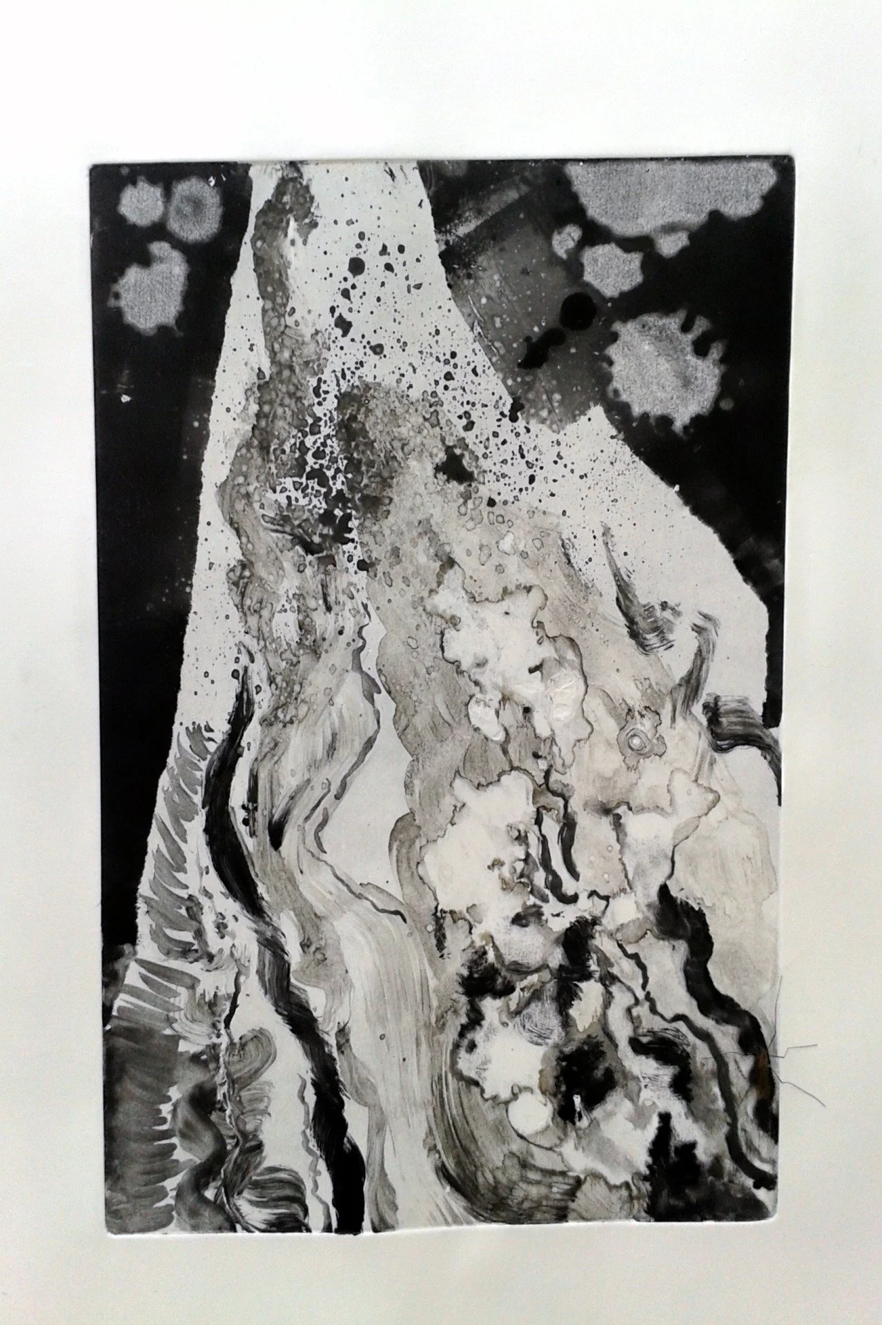
In this first mono-print, I first made a rich dark ink background using a heavily inked roller,masking off some areas with ripped paper. I then worked back into this, experimenting with removing some areas with a rag and white spirit and making different marks with brushes. I also used a rigger brush with a thin mix of white spirit and ink to make fine marks over the top. The black ink rolled onto the plate made a dense darkness and the white of the paper on un-inked parts, painted parts seemed to glow, especially where marks made had soft edges. I liked the ripped edge where I'd used torn paper - it reminded me of the ragged, dramatic cliff edges I'd drawn in Shetland and I thought over-all that the print had a sea-like look to it. I wasn't very happy with the composition however. The whiter space seemed to cut across in a very static, uninteresting way - I felt more variation in the direction of marks and a more dynamic path would have been much more visually interesting.
In the second print I did today, I again started with dark tone, masked off with torn paper but this time I made a more interesting shape which cut across the space in a more unpredictable, dynamic way. I used white spirit dropped on the ink in the dark areas which made soft, cloud like effects, making subtle marks and I also used different brushes in a variety of ways making both repeated marks and flowing lines. I really like the painting-like feeling of this and the playfulness of mono-printing - I felt I was free to experiment with a variety of approaches and could print and see the effects very quickly. I also spattered a thin mix of ink and white spirit, making a sea-spray like effect and giving a sense of movement and energy. White spirit used on its own in this way had a similar effect on the black ink, removing it. This print also had an organic look to it - the ripped edges again reminding me of cliff faces or rock edges, their harshness contrasting with the more free flowing, sea-like painted area. In contrast with the work I'd been doing recently, for instance the tree sketches, there wasn't a flat, unvarying, constant 'abstract' space behind a realistic form - the whole print was abstract, an experimentation with shapes and lines and effects. I feel I'd like to experiment further with abstraction, including organic-like forms like this to give a suggestion of physical reality next to abstract space - a way to further develop ideas about contrast between/difference between physical reality and abstract space.
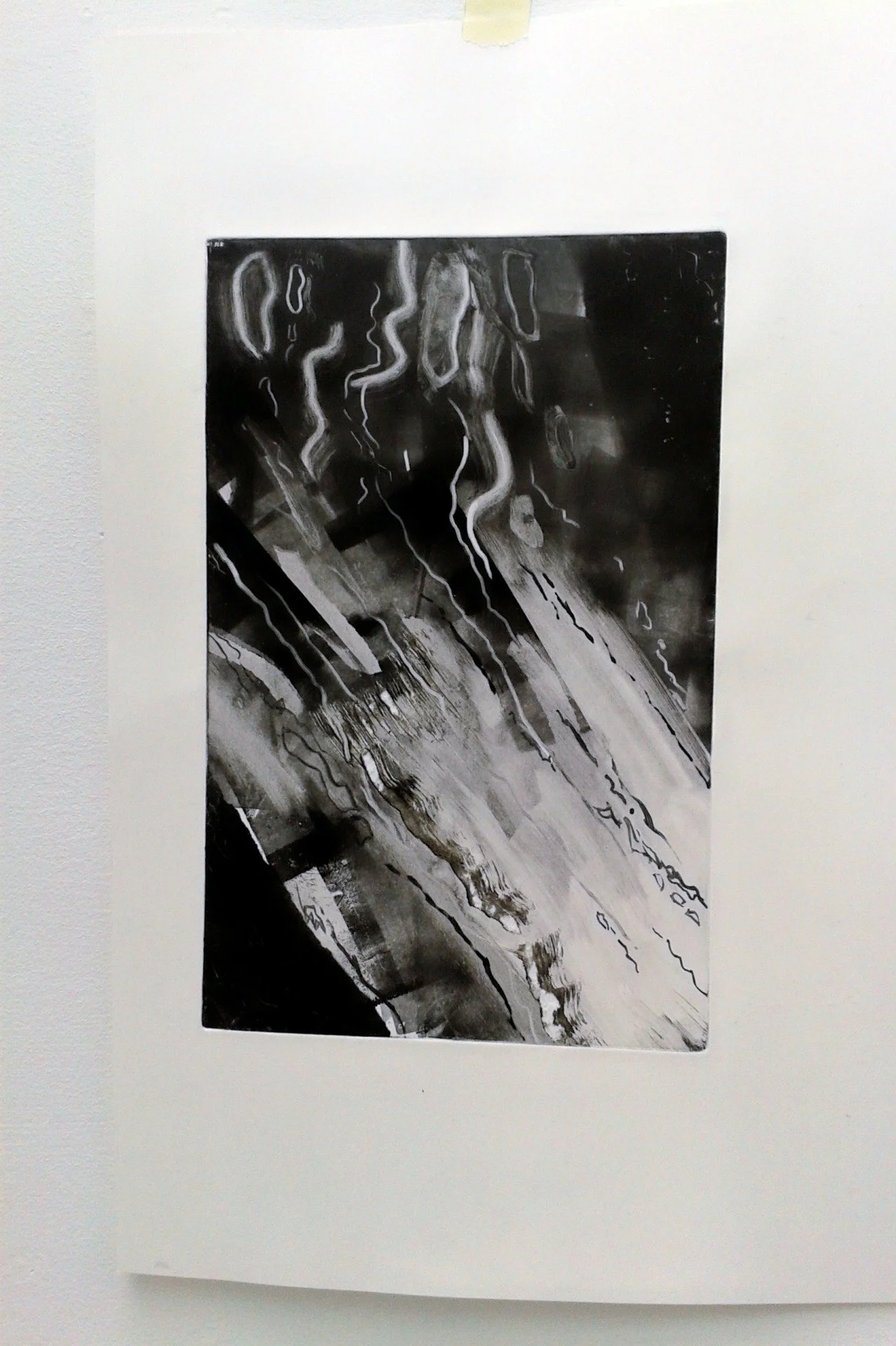
The third print was based on a sketch of a tree which had been done in a very loose was, suggesting the shape of the tree with sketchy, subtle marks. This translated into the way I used the brush to paint the ink onto this plate, which I thought had quite a calligraphic quality - the tree became flowing, expressive lines against the misty background. I made the background in a slightly different way. After making the layers of tone, I wiped over it with a cloth slightly damp with white spirit and circles, making hazy curving patterns like vapour trails or atom paths. This is an effect I'd like to experiment with further.
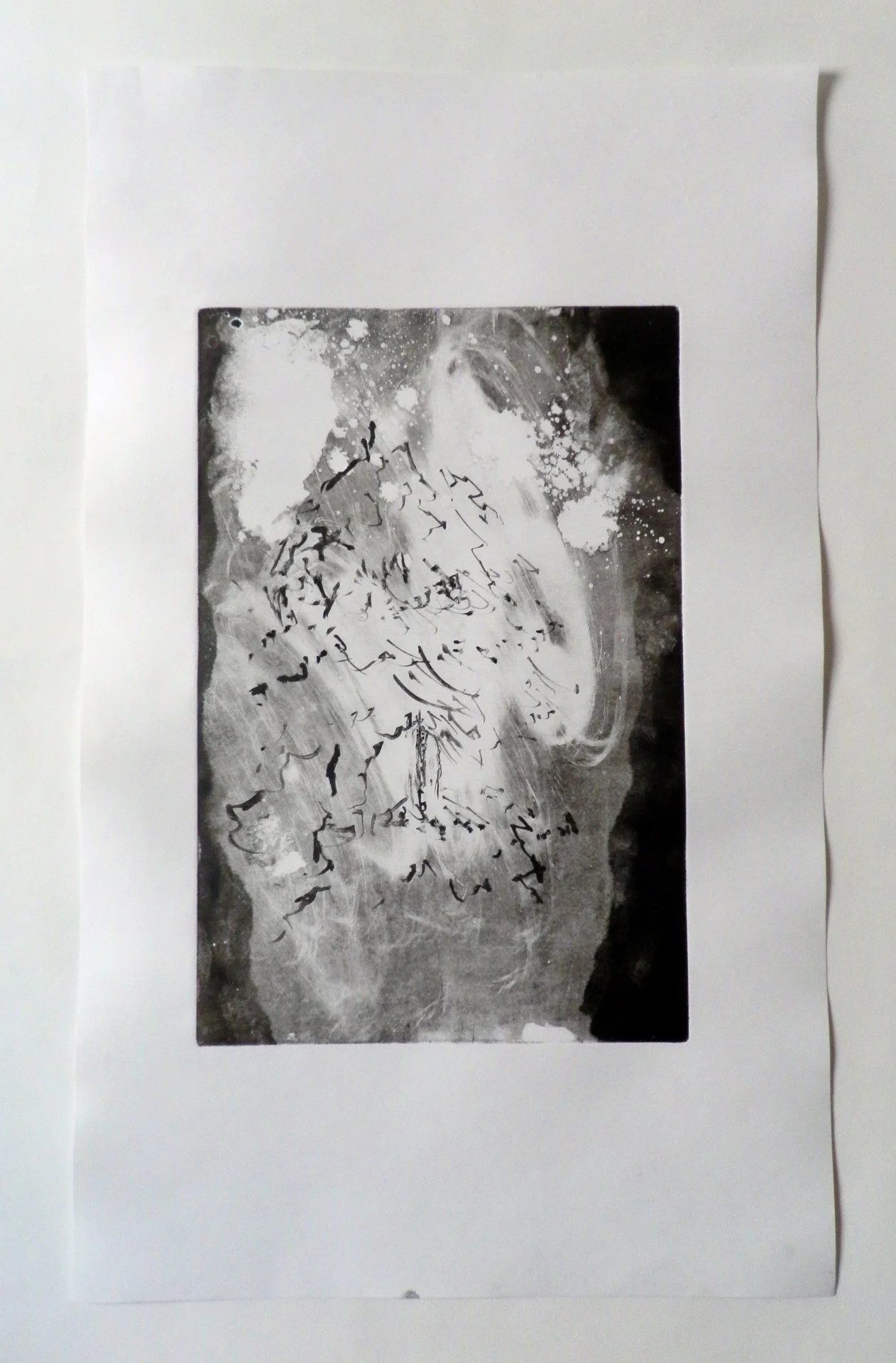
With these mono-print experiments, I felt I'd explored some of the possibilities of making subtly varying but powerful abstract space, in which natural, ephemeral forms can exist briefly. I think the main problems I can across were getting then balance right between this and how much definition the tree should have. To look at the further, I thought I could possibly make etchings. Here the lines used to draw the lines would be more fixed - I could work with mono-print techniques when inking up the print to experiment further with contrasting line and tone.